
Building a Canadian mail service brand that feels trustworthy, modern, and unmistakably Canadian.
Overview
Letterhome began with a simple problem.
Canadians living abroad often need to send legal documents, signed paperwork, tax forms, and important letters within Canada. Printing, mailing, and coordinating those documents internationally is slow and inconvenient.
The challenge was to create a brand that instantly communicated trust, Canadian identity, and simplicity while avoiding clichés commonly associated with postal services.
The result is a visual identity built around one recognizable symbol: the postage stamp.
The Challenge
Most mailing companies communicate logistics.
Letterhome needed to communicate reassurance.
The brand needed to answer three questions immediately:
- What is this?
- Who is it for?
- Why should I trust it?
The identity also needed to feel premium enough for legal and government documentation while remaining approachable for everyday Canadians living overseas.
Research & Discovery
Before opening Illustrator, I explored the visual language surrounding mail.
I collected references from:
- Canadian postage
- Passport stamps
- Vintage envelopes
- Postal cancellations
- Maple leaf symbolism
- Security printing
- Travel ephemera
Rather than copying existing postal aesthetics, I looked for recurring shapes that people subconsciously associate with sending mail.
Thumbnail Sketching
Exploring hundreds of ideas before opening Illustrator
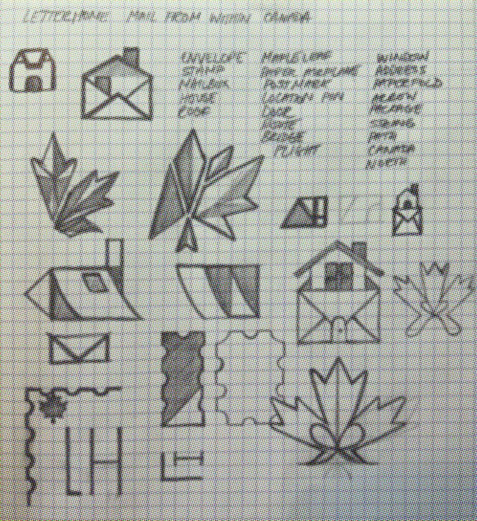
First Round of Thumbnail Sketches
Envelope, Stamp, Mailbox, House, Roof, Maple Leaf, Paper Airplane, Postmark, Door, House, Bridge, Flight, Window, Address, Paper, Fold, Package, Arrow, String, Path
Final Round of Thumbnail Sketches
Stamp, Door, House
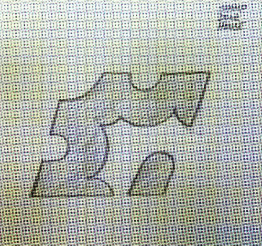
Following Alan Peters’ identity design process, the project began with rapid thumbnail sketching.
Instead of chasing one logo immediately, I explored dozens of visual metaphors built around:
- postage stamps
- envelopes
- maple leaves
- houses
- mailboxes
- paper airplanes
- folded paper
- routing paths
- location pins
- doors
- windows
- Canada
Working quickly in black pencil prevented me from becoming attached to any single idea.
The goal wasn’t to create beautiful sketches.
The goal was to discover unexpected combinations.
Finding the Core Idea
As the exploration continued, one shape kept reappearing.
The perforated edge of a postage stamp.
Instead of treating the stamp as a border, I enlarged it until it became the brand itself.
Cropping and scaling the perforations transformed them from decoration into a recognizable design language.
That single decision ultimately influenced almost every visual element that followed.
Designing the Logo




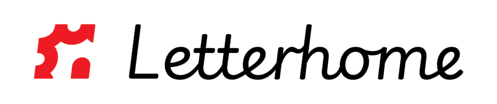
The final logo combines:
- a stylized house
- a simplified envelope
- the familiar rhythm of postage stamp perforations
Together they reinforce the idea of mail arriving home.
The icon is intentionally simple enough to function at favicon size while remaining distinctive on signage, packaging, and social media.

Motion & Digital Applications
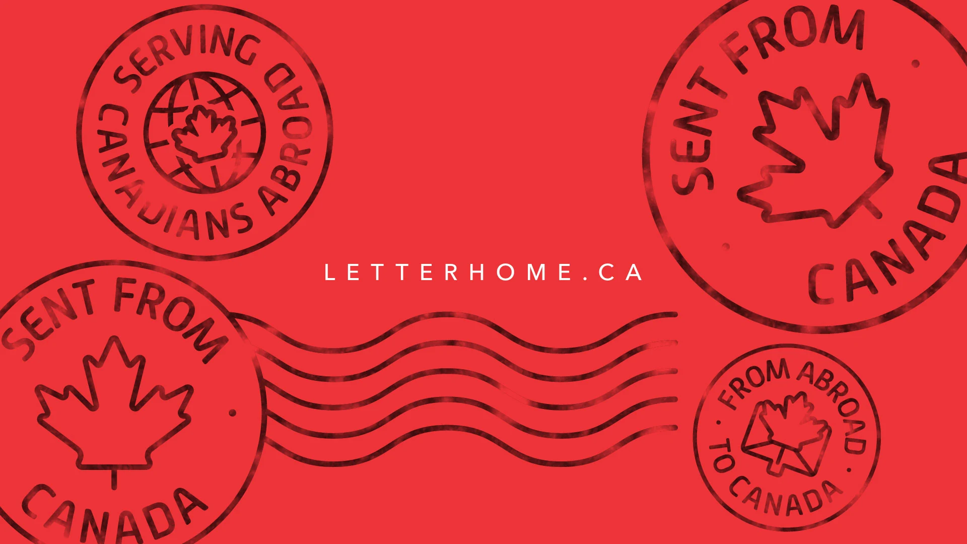
To extend the identity beyond static applications, I developed a short brand animation that introduces Letterhome through motion. The sequence uses the oversized postage stamp motif as a transitional device, revealing the logo before expanding into supporting brand assets such as custom postal marks and cancellation lines. Rather than relying on decorative effects, the animation reinforces the core visual language established throughout the identity system, demonstrating how a single graphic element can unify branding across digital interfaces, video, and social media while creating a memorable first impression.
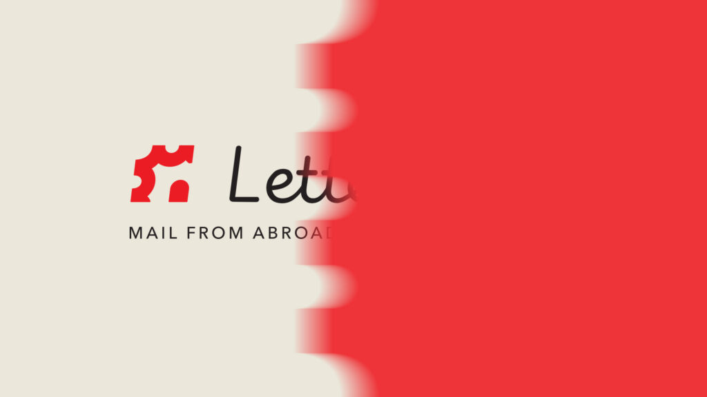
Because the brand system relies on simple geometric forms, it translates naturally into motion.
The stamp motif slides, reveals content, and frames imagery without requiring complex animation, creating a consistent experience across web, video, and social media.
Designing the Stamp Collection
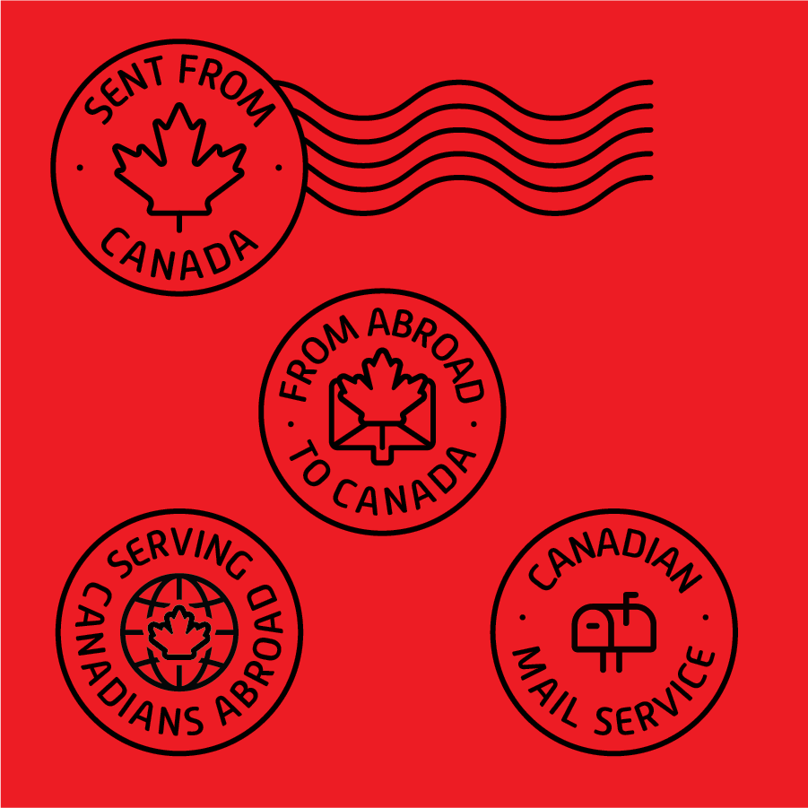
To reinforce authenticity, I designed a series of custom postal marks inspired by real cancellation stamps.
These include messages such as:
- Sent From Canada
- Serving Canadians Abroad
- Mailing Made Easy
The stamps function as both decorative elements and trust signals throughout the brand.
Brand Assets
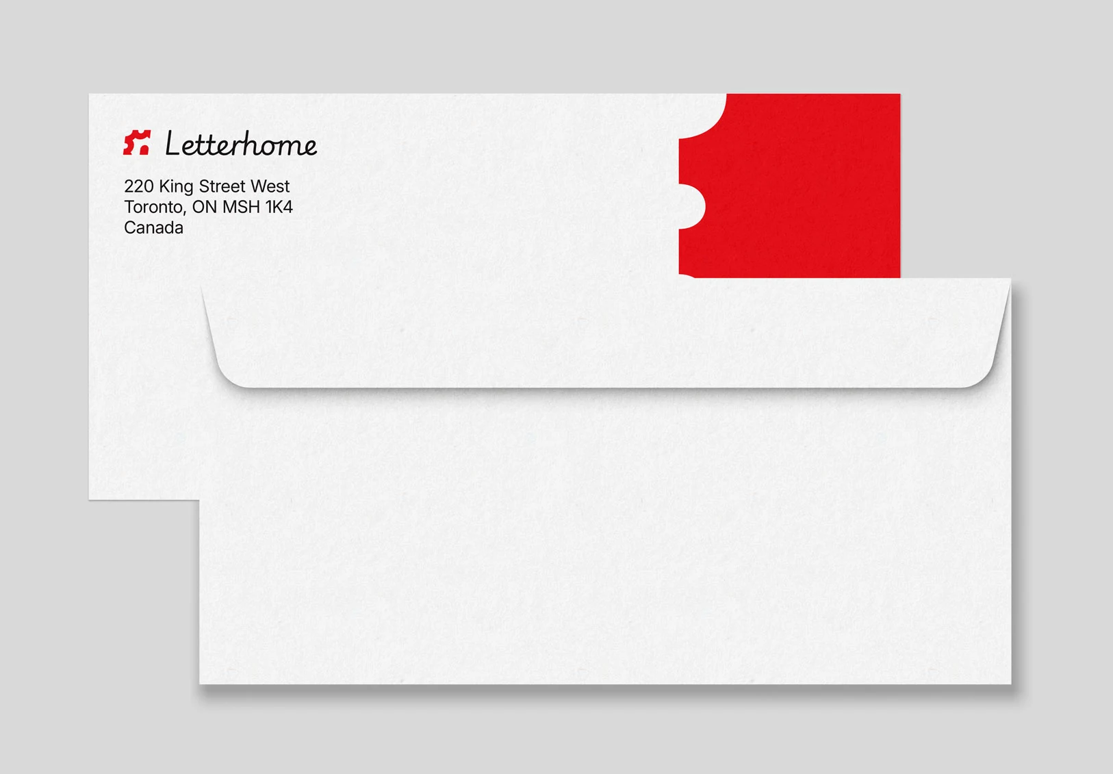
Additional deliverables included:
- envelope design
- stationery
- postal marks
- approval stamps
- service badges
- iconography
- social templates
- website graphics
Each asset contributes to a cohesive ecosystem rather than existing independently.
Designing the Website
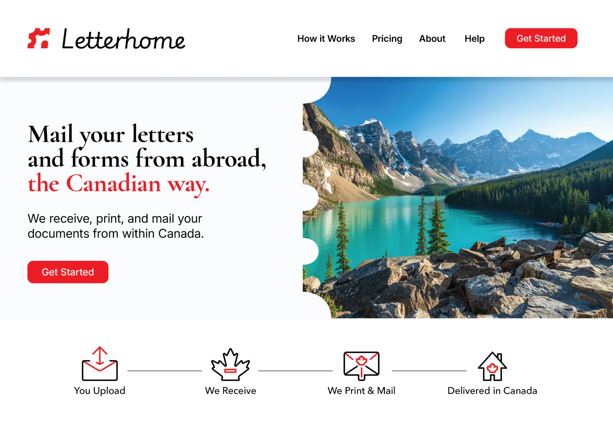
The website extends the visual language established in the identity.
Large typography, generous whitespace, and photography create confidence while the cropped stamp motif divides content sections without adding visual clutter.
Every design decision reinforces the service promise:
UI/UX MOCKUPS
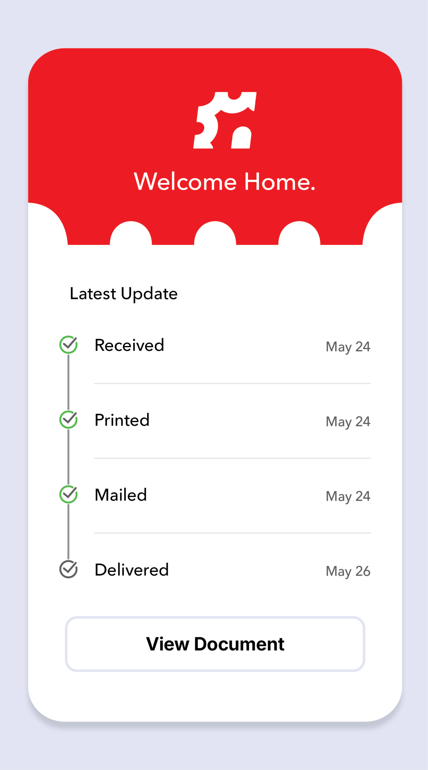
To simplify what could otherwise feel like a complex process, I designed a clear visual journey that explains the Letterhome service in just a few steps. By combining custom iconography, concise messaging, and a consistent visual language, the experience quickly communicates how documents move from a customer’s inbox abroad to a recipient’s mailbox in Canada. The result is an interface that reduces uncertainty while reinforcing the brand’s promise of making domestic Canadian mail accessible from anywhere in the world.
While originally developed as a graphic device, the perforated stamp motif naturally extends into the digital interface. It frames content, separates sections, and guides the user’s attention without introducing unnecessary visual complexity. Applying the motif consistently throughout the UI reinforces the brand at every touchpoint, demonstrating how a single design element can evolve from a logo concept into a functional component of the overall user experience.
Social Media System
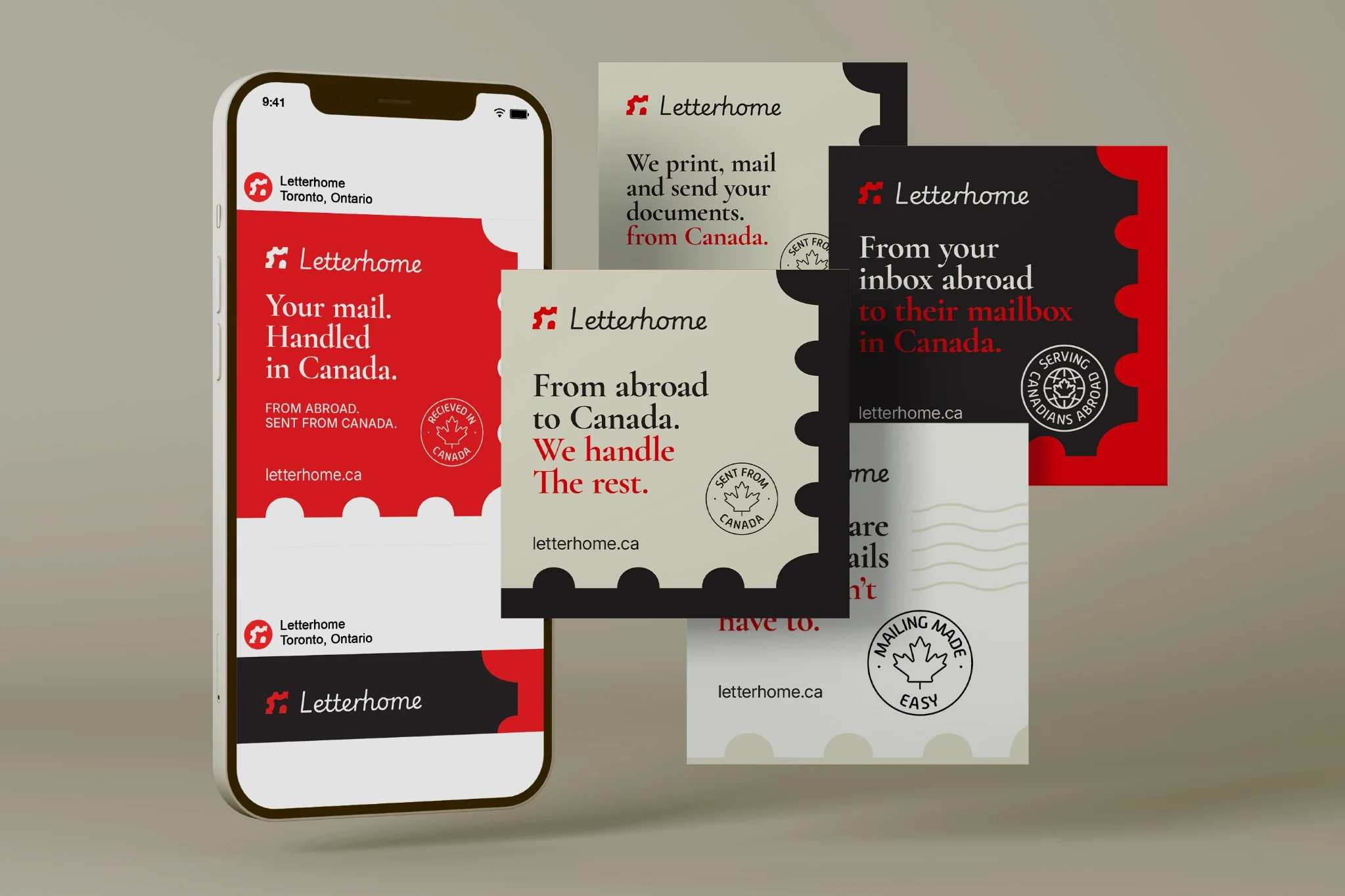
Instead of producing disconnected advertisements, I created a modular social system.
Each post uses the same ingredients:
- oversized typography
- bold colour blocking
- postage-inspired framing
- consistent messaging
- reusable stamp graphics
This allows future campaigns to remain visually consistent while requiring minimal production time.
Outcome
Letterhome evolved from an idea into a complete brand system capable of supporting future growth.
The project demonstrates how a single visual concept can influence every customer touchpoint, from the logo to social media, stationery, website design, and motion graphics.
Rather than relying on trends, the identity is built around timeless visual associations that make the service feel immediately familiar, trustworthy, and unmistakably Canadian.