This project explores a modern approach to machine shop branding, focusing on precision, trust, and industrial clarity.
Modern Machine Shop Branding Built on Precision
Designing a strong identity for a machine shop requires more than a logo. It demands a deep understanding of how the industry thinks about accuracy, reliability, and performance.
This machining company branding project for VP Expert Precision Machining explores how visual identity can reflect technical capability and trust, while remaining scalable across real-world applications such as equipment, signage, and documentation.
The Challenge
Creating a Brand That Reflects Precision and Trust
VP Expert operates in a space where tolerances are tight and expectations are high. The brand needed to communicate:
- Precision and technical accuracy
- Reliability under pressure
- Professionalism and trust
- Modern capability, not outdated industrial clichés
The challenge was to create a system that felt engineered rather than decorative.
Concept Exploration
Option 1 — Badge Motif
This initial direction explored a shield-based identity, combining a custom “VP” monogram within a structured badge form.
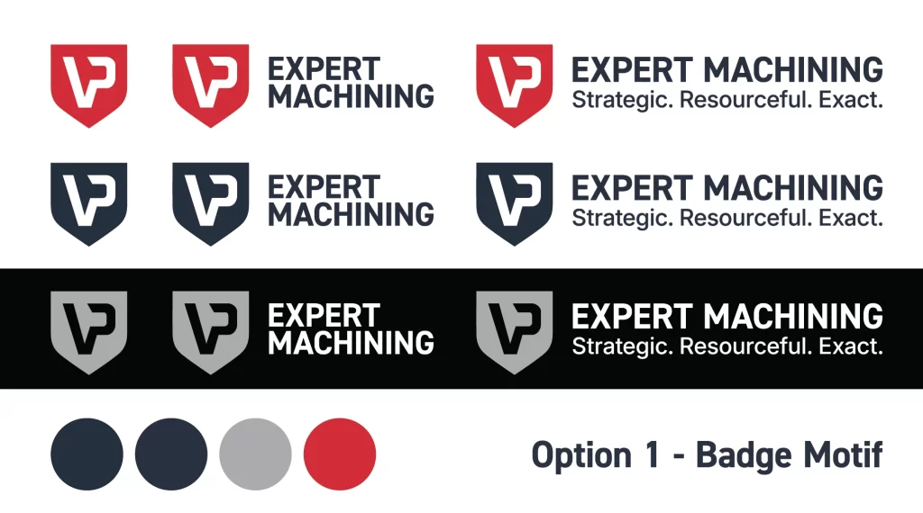
This concept leaned into:
- Strength and durability through the shield silhouette
- Trust and protection, common in legacy industrial branding
- A bold, contained mark that would work well in decals, equipment branding, and uniforms
The internal geometry of the “VP” was constructed using sharp angles and negative space, subtly referencing machined cuts and tool paths.
While this direction felt solid and dependable, it ultimately leaned more toward heritage branding than forward-looking precision.
Refinement Phase — Aligning with Industry Language
Option 2 — Chuck Inspired Motif
The second direction shifted toward something more conceptually tied to the craft itself.
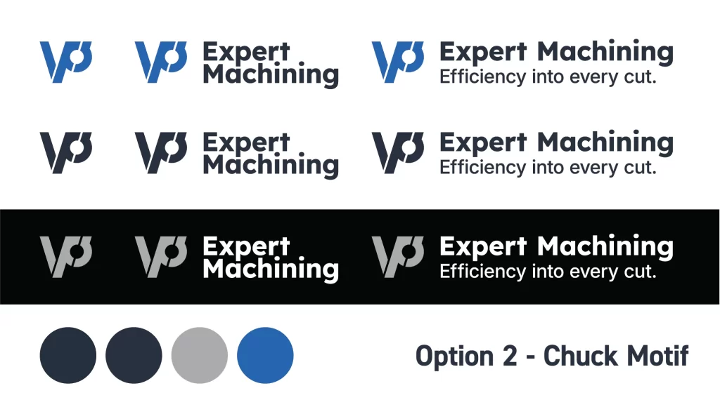
Inspired by the form of a machining chuck, this concept introduced:
- A circular mark representing rotation, balance, and precision
- A central point referencing axis alignment and tolerances
- Angular forms that echo cutting tools and material removal
This direction aligned more closely with how machining professionals think about their work — not just strength, but controlled precision and repeatability.
The typography was kept clean and modern to complement the mark, reinforcing clarity and efficiency.
Final Identity System
A Modern Industrial Brand Built for Scalability
The final machining company branding system evolved from the chuck-inspired concept into a refined, flexible identity.

Key decisions included:
- Circular emblem with flowing internal geometry
The final mark suggests motion, material flow, and precision machining processes without being overly literal. - Balanced “VP Expert” wordmark
Emphasis on “Expert” reinforces positioning, while “VP” anchors the brand name. - Industrial colour palette
Deep navy and neutral greys establish trust and professionalism, while a controlled use of blue introduces a sense of technical clarity and modernity. - System flexibility
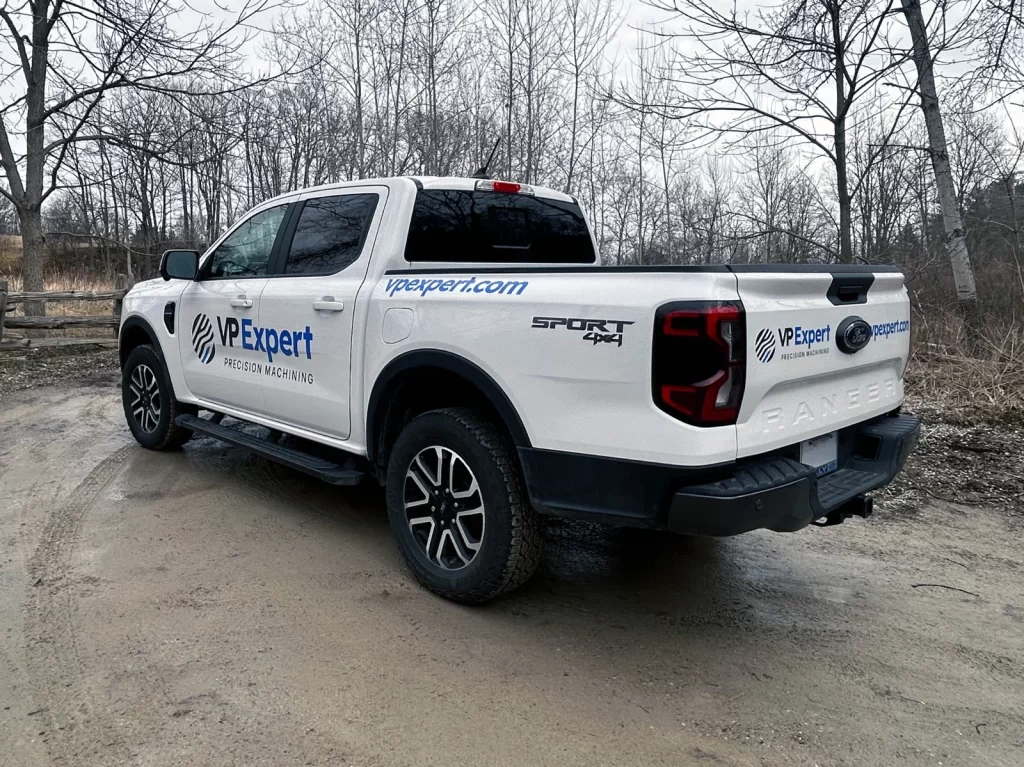
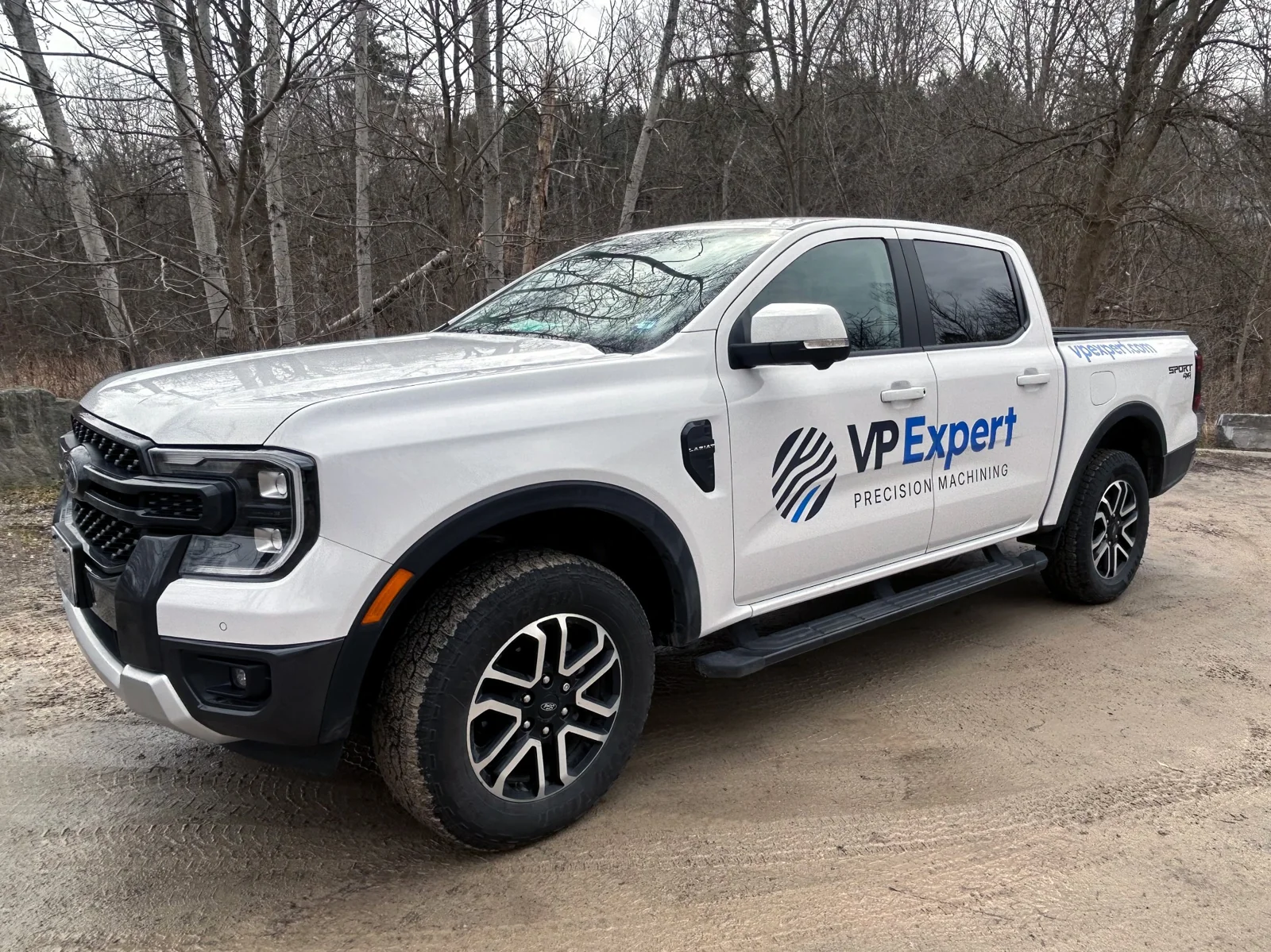
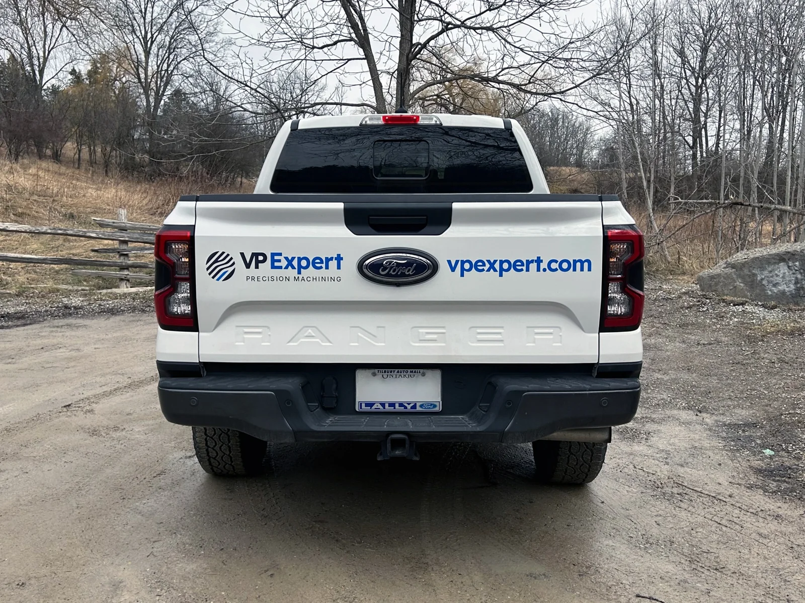
The identity was designed to work across:- Shop signage
- CNC machine decals
- Digital platforms
- Documentation and invoices
- Vehicle wrap
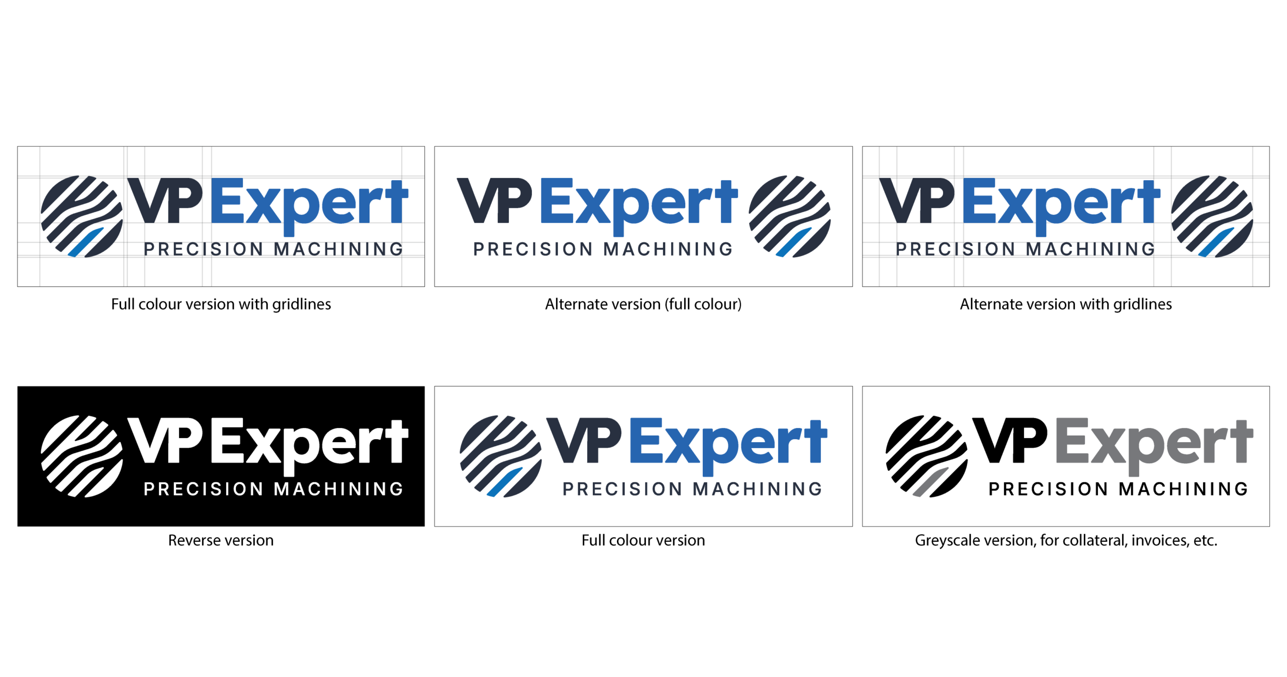
Multiple logo variations, including full colour, reverse, and greyscale, ensure consistency across all touchpoints.
Design Thinking
From Symbolic Strength to Functional Precision
Early exploration focused on symbolic strength through the badge motif.
However, the breakthrough came from aligning the brand with actual machining principles:
- Rotational systems
- Mechanical balance
- Tool paths and cutting motion
- Precision alignment
This shift resulted in a brand that feels authentic to the industry, rather than relying on generic industrial tropes.
Outcome
Positioning VP Expert as a Modern Machine Shop Partner
The final identity positions VP Expert Machining as:
- A technically capable machining company
- A reliable partner for precision work
- A modern, detail-oriented operation
The brand now reflects both expertise and clarity, helping differentiate the company in a competitive manufacturing landscape.
More importantly, it establishes a foundation that can scale with the business as it grows, ensuring consistency across every touchpoint.
Reflection
Designing with Industry Insight
This project reinforced the importance of grounding design decisions in real-world context.
While the badge concept was visually strong, it wasn’t until the identity began referencing actual machining processes that it became truly distinctive.
By shifting from symbolic to functional thinking, the final result became more authentic, scalable, and effective.
As with all effective branding projects, the success of this machining company branding came from aligning visual design with real-world function and industry thinking. By grounding the identity in precision, motion, and mechanical clarity, the result is a system that feels both authentic and scalable. If you’re interested in how this approach translates across different industries, explore another brand identity design project to see how strategy and form adapt to different challenges while maintaining a consistent design philosophy.