In 2013, while employed at factor[e] design initiative (now known as Parallel), I was tasked with developing a visual identity for Pete Smith’s new consultancy, Meaford Group. Pete requested a typographic lettermark — something clean and professional — that would reflect his role in managing projects and services for a wide variety of clients. Our early conversations focused on the theme of structure, clarity, and multi-faceted guidance, which ultimately informed the concept of a modular, geometric “M” mark.

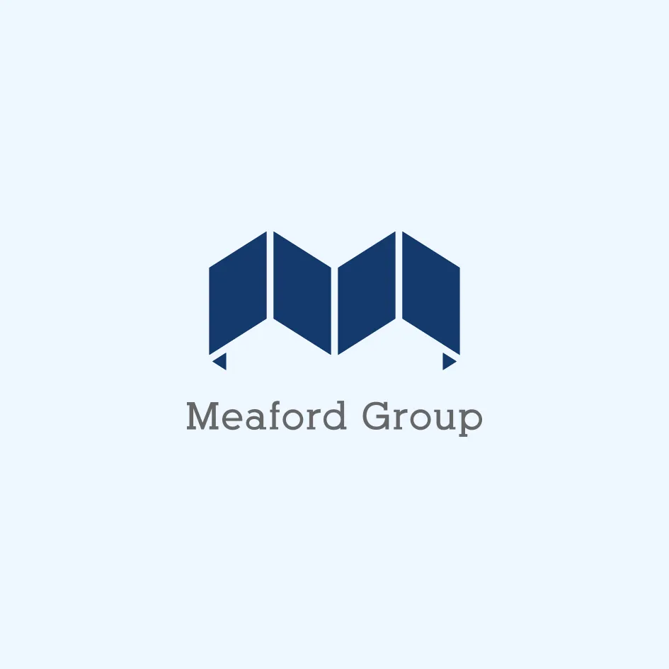
The final logo solution references both a folded map and a physical binder — two forms of analog information management that subtly communicate organization, planning, and dependable navigation. The folded form suggests a directional flow while remaining abstract enough to adapt across multiple industries. The simple, structured geometry gives the mark a confident and modern tone, while the logotype pairing was chosen to reinforce credibility and readability across digital and printed formats.
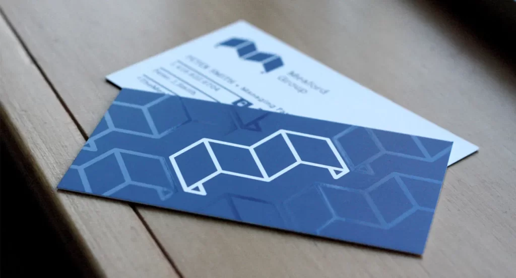
The supporting business card design builds upon this system with an elegant and tactile execution. The reverse side features the folded “M” mark as a repeated pattern, creating a dimensional backdrop that subtly reinforces the brand’s modular and structured identity. A UV spot varnish was applied to these background elements, adding a layer of sheen and texture that catches the light and draws attention to the contrast between the supporting pattern and the central logo. This finishing detail not only elevates the card’s physical presence but also reinforces the brand’s attention to detail and precision. The crisp white-on-navy front ensures clarity and professionalism, making the card a powerful representation of Meaford Group’s disciplined and dependable approach.