Opening Doors: The Indwell IDENTITY DESIGN STORY
In 2013, while working at factor[e] design initiative, I had the opportunity to co-create a brand identity that continues to resonate deeply a decade later. Indwell — a Canadian Christian charity that has been supporting vulnerable adults with mental health challenges for over 50 years — approached our studio in search of a visual identity that could reflect both their mission and their spirit. At the time, they had already impacted countless lives, and their reach has only grown since.
I collaborated with my colleague Megan Smith on the identity design, and together we aimed to craft a brand that was more than just a logo — it needed to be a symbol of transformation, hope, and home.
The Concept: Hope and Housing
Indwell’s work is grounded in restoring dignity through supportive housing. We wanted the identity design to embody that sense of transition — a journey from uncertainty to stability. That’s where the concept of the open door came into play.
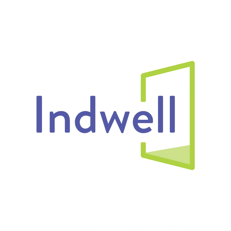
The logo is anchored by a clean, modern wordmark set in Brandon Grotesque, a font selected by Megan to complement the linework of the mark itself. Its humanist touches and soft geometric forms created the right balance of approachability and professionalism.
We refined the end caps of the door icon to better echo the rounded terminals and geometric softness of Brandon Grotesque, ensuring a more cohesive relationship between the symbol and the wordmark.
The graphic element — a stylized open door — was carefully integrated with the type to emphasize Indwell’s mission: opening doors to hope and housing. Rather than existing as a standalone symbol, the door becomes part of the logotype, allowing the logo to illustrate the very process of becoming housed.
Designing with Meaning
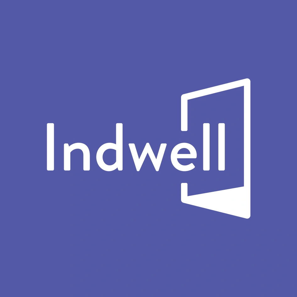
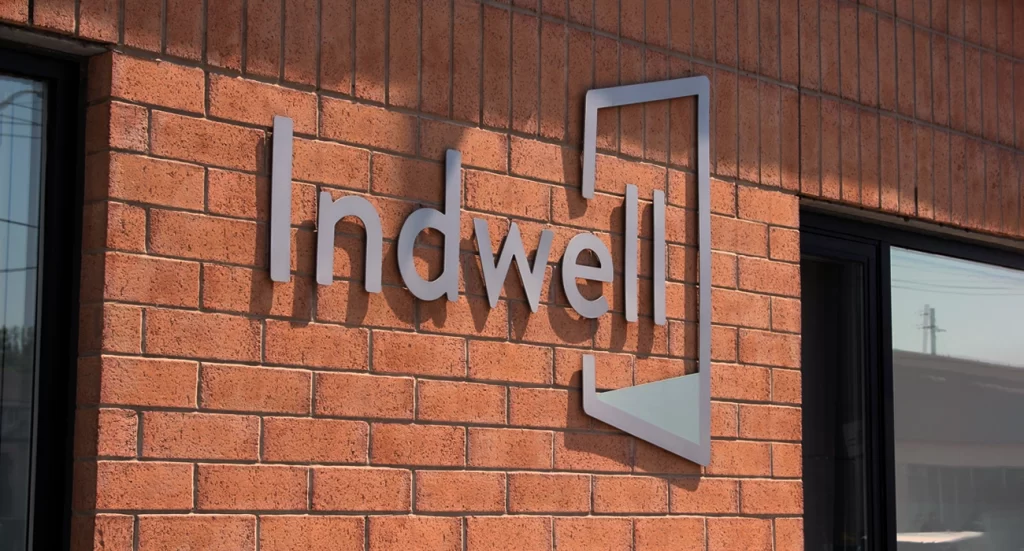
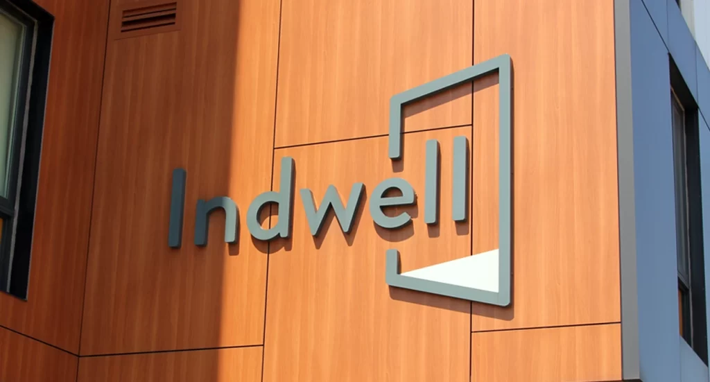
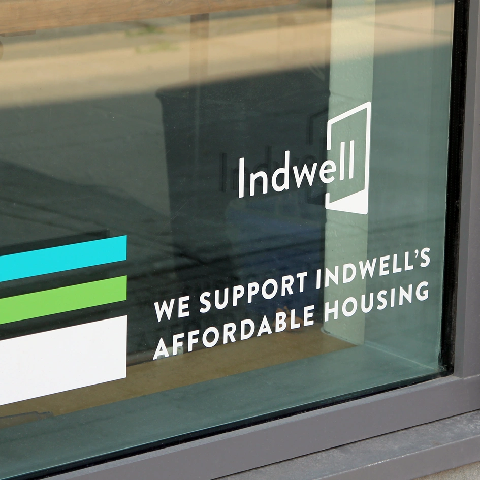
The simplicity of the mark allows it to be incredibly versatile. From signage on buildings to decals on windows, the logo is equally effective at human scale or street level. The design has since been adapted across dozens of sites throughout Southern Ontario.
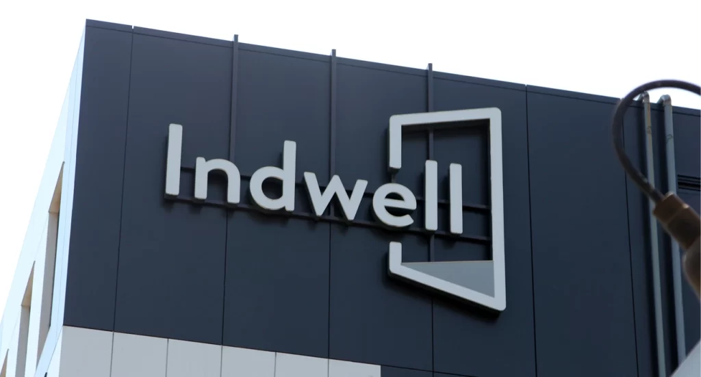

As of today, Indwell provides housing and support for over 1,200 individuals across 13 communities, with buildings in Hamilton (5), Kitchener (2), and London (4), among others. Each site carries the same quiet strength as the identity we built: a consistent reminder that everyone deserves the dignity of home.
Lasting Impact
It’s rare to work on a brand identity that continues to feel so relevant and connected to the people it serves. Seeing the Indwell mark on buildings across the province is a humbling reminder of the power design has to shape not just brands, but lives.
IN CONCLUSION
The Indwell identity design was crafted to reflect more than just a name — it tells a story. The open door icon paired with the wordmark is a deliberate and powerful symbol. It represents welcome, stability, and transformation. Each line in the mark was drawn with purpose, balancing geometric precision with warmth. The decision to use Brandon Grotesque as the typeface was critical in maintaining this tone. Its rounded forms and friendly presence echo the compassionate and human-centered mission of Indwell, while its architectural integrity complements the structured nature of the housing sector.
The logo’s visual simplicity belies the depth of its message. The door, slightly ajar, suggests movement — a threshold being crossed, a life being changed. It frames the final letters in “Indwell,” suggesting that this is more than a home — it’s a place of belonging, where individuals can begin again. The symmetry between the typography and the icon ensures that the design is versatile across all applications, from building signage to digital platforms.
As the logo has been implemented across Indwell’s many housing projects throughout Ontario, it has become a beacon — a quiet, confident signal that hope lives here. It stands as a reminder that thoughtful design can amplify mission-driven work and help organizations like Indwell build meaningful connections with the communities they serve.
If you’re building a brand that exists to make a difference, don’t underestimate the power of design. Partner with people who understand how to tell your story visually. Whether you’re launching a non-profit, developing a social enterprise, or revitalizing an established identity design, let’s collaborate to create something that’s both beautiful and deeply meaningful.