Mister Coffee Rebrand: Character Driven Coffee Brand Identity
Hypothetical Rebrand for a Legacy Coffee & Services Delivery Company
Brewing Up a Better Brand

This Mister Coffee rebrand project explores a character-driven coffee brand identity for a corporate coffee delivery business. Mister Coffee has been serving corporate clients across Toronto and Guelph since 1980, with affiliate partners delivering nationally from Vancouver to Halifax. This self-initiated rebrand explores how thoughtful design can elevate a legacy business without sacrificing familiarity.
Creating a Brand Mascot for Mister Coffee
I developed a character-driven logo system built around a cheerful, anthropomorphic coffee cup — playful but dependable. I aimed to create a cartoon-style brand mascot that brings charm to the character logo design.


The result is a retro mascot logo and visual identity for a delivery brand that appeals across Toronto and beyond.
This character is a lively blend of approachability, professionalism, and classic charm, perfect for representing Mister Coffee’s reliable delivery service in a fun and memorable way:
- The main form is a white ceramic coffee cup, rounded and slightly tilted forward to give a sense of motion and momentum.
- His right arm and both legs are expressive black limbs with strong cartoon linework, suggesting agility and charm.
- In his left hand, he carries a classic brown briefcase, reinforcing the “corporate delivery” theme and connecting visually with the shoe color for balance.
- On his feet, he wears brown work shoes with simple detailing — a nod to his role as a working professional.
- The absence of extra clothing (like a hat or tie) keeps the design clean, focused, and flexible across applications.
- The primary character colors — white, dark brown, and coffee tan — balance approachability with visual contrast, making the mascot pop on various branded materials.
Challenge Of Legacy Coffee Delivery Logo
The type treatment features bold, rounded lettering reminiscent of vintage café signage, designed to convey both personality and professionalism.
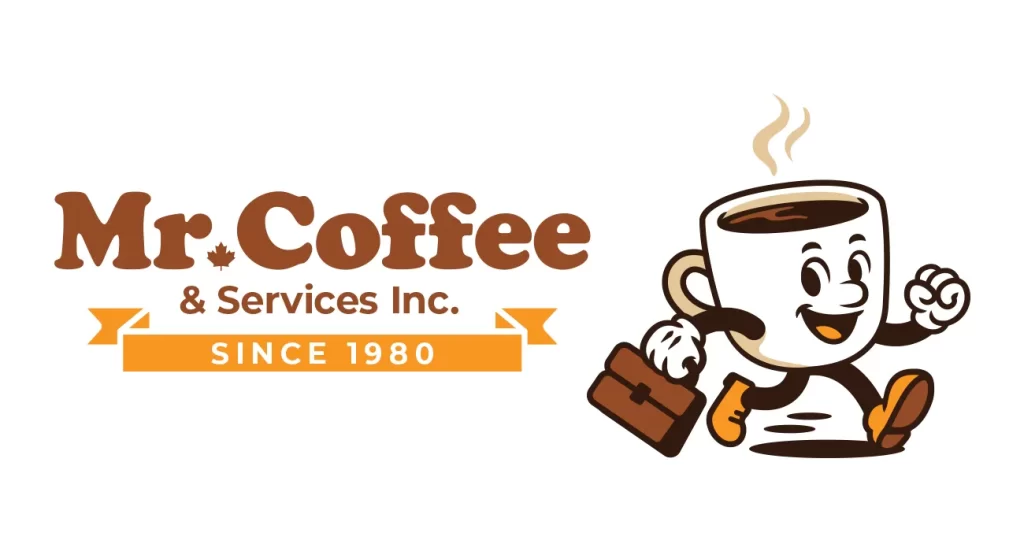
To preserve the brand’s longstanding reputation, a colored ribbon featuring “Since 1980” was added. This small detail reinforces Mister Coffee’s reliability while giving the identity a badge-like feel that works across formats.
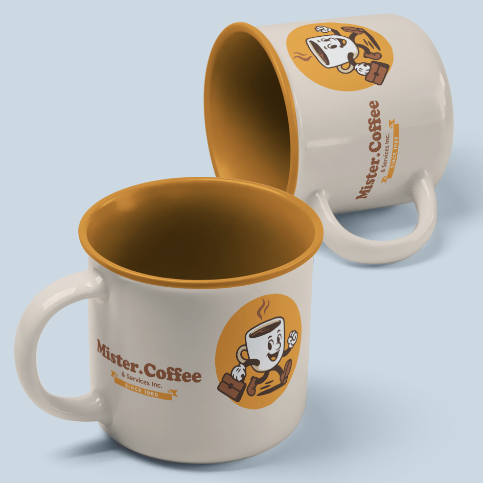
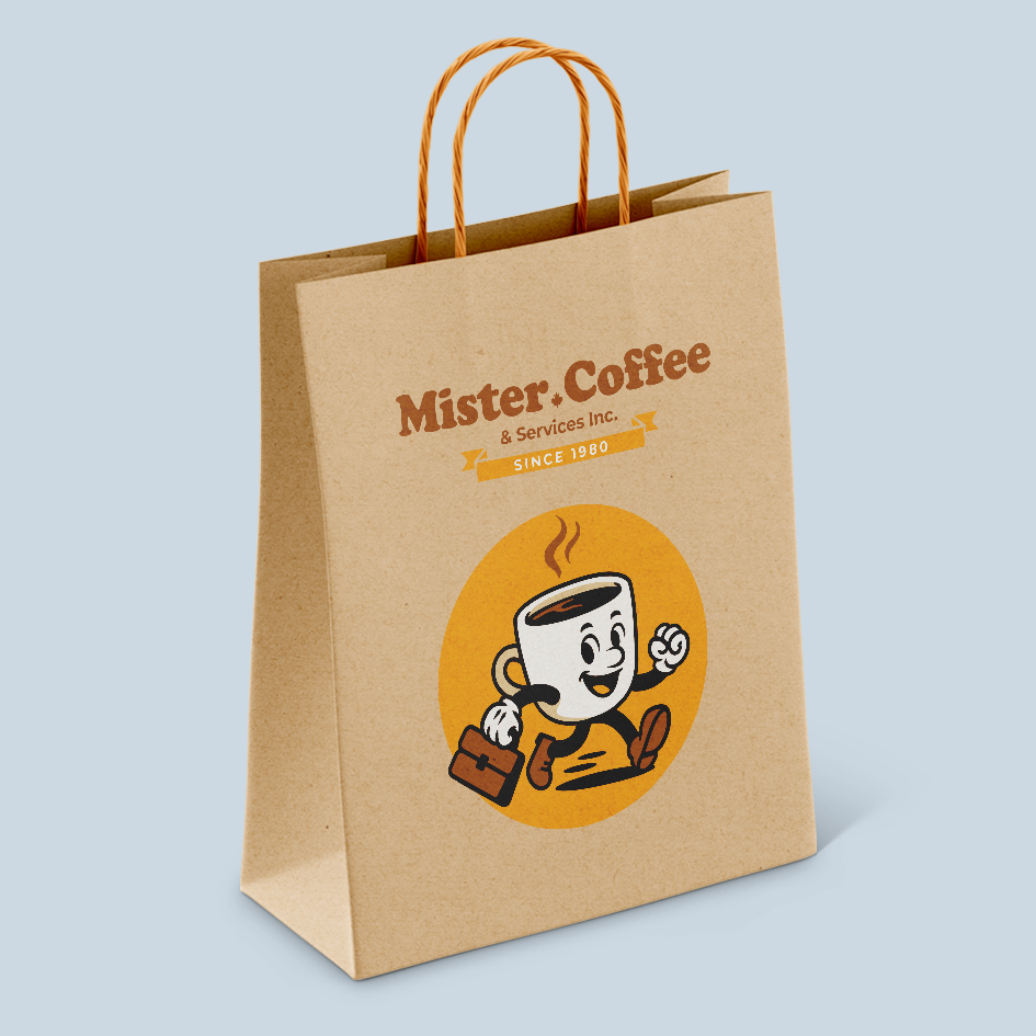
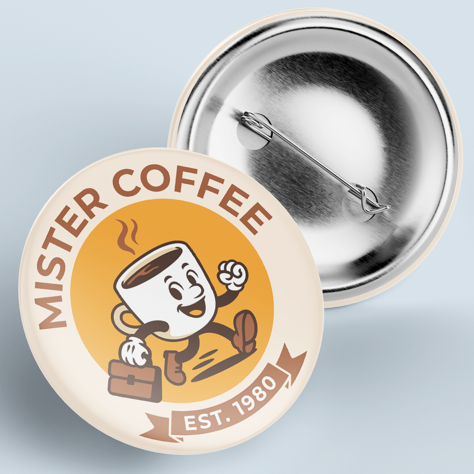
Designed to Scale
From branded delivery cups and packaging to uniforms, fleet vehicles, and digital touchpoints, this identity system was built for flexibility. Every visual element was designed to stay consistent across formats while staying true to the brand’s warm and service-driven roots.
Why It Matters
This rebrand wasn’t about change for the sake of it — it was about clarity, connection, and competitiveness. Great design helps customers trust and remember a business. Mister Coffee’s hypothetical identity refresh shows what’s possible when form and function align. This coffee brand identity redesign positions Mister Coffee for modern growth.
If you’re looking for a branding expert, or Canadian brand identity designer to modernize your brand, let’s connect.