As Sigma Systems expanded its global footprint, the need for a more strategic and scalable digital presence became clear. I led the redesign of their corporate website to better communicate their complex B2B software offerings, highlight customer success stories, and support marketing and sales alignment. The new site modernizes Sigma’s visual identity, simplifies the product narrative, and delivers a flexible content structure built to support growth across regions and verticals.
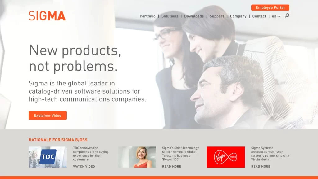
The hero section features a clean, spacious layout with a strong headline — “New products, not problems.” — that positions Sigma as a solution-oriented brand. The supporting text clearly communicates Sigma’s market niche (catalog-driven software for high-tech communications companies), while the “Explainer Video” CTA offers immediate engagement. The blurred background image of professionals suggests collaboration and enterprise focus without overwhelming the message.
This high-contrast orange band acts as a visual and narrative anchor: “An entire suite devoted to creating, selling & delivering digital products.” The bold color grabs attention, breaking up the otherwise neutral palette, and introduces Sigma’s holistic approach. The line breaks are deliberate for rhythm and scanning ease, supported by the structural symmetry of a centered layout.
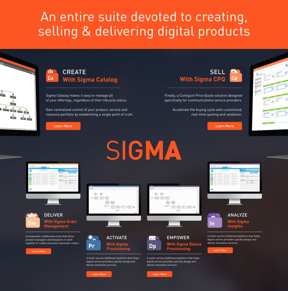
This section applies a visual “ecosystem” approach, using a horizontal icon-and-description grid to reinforce the modularity of Sigma’s platform. Each product is given equal visual weight, underlining that no component is secondary. The use of abbreviated names (e.g., “Ca” for Sigma Catalog) adds a layer of branding consistency, akin to chemical element blocks — evoking structure, clarity, and interoperability.
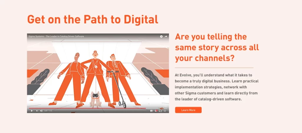
This section refreshes the user journey with animation and a question-based headline: “Are you telling the same story across all your channels?” The animated video draws visual interest and humanizes the digital message. The layout uses asymmetry to draw the eye across both the media and the copy, encouraging interaction and reflection.
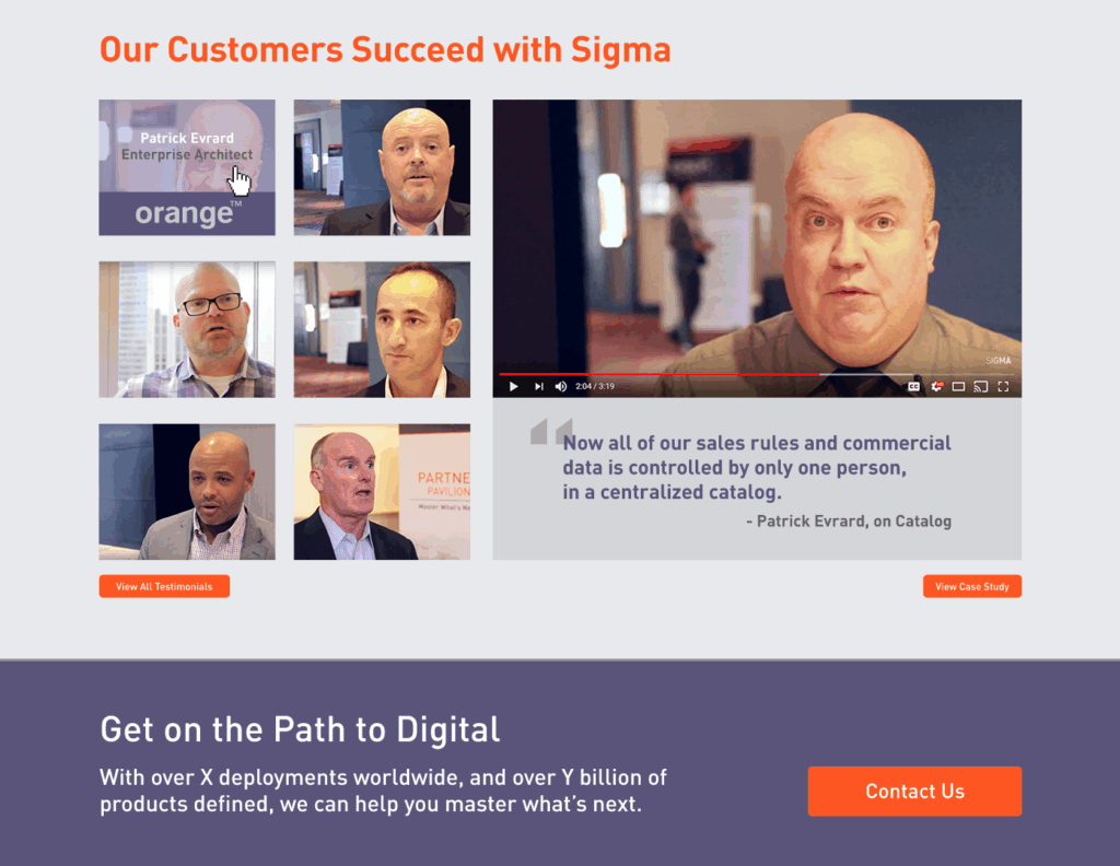
Direct video testimonials create trust and authenticity, showcasing real users and decision-makers who’ve benefited from Sigma’s solutions. The modular grid layout allows for quick scanning while highlighting individual stories. I was responsible for shooting and editing these customer video testimonials, which were captured during our annual user conferences. This hands-on involvement ensured each video aligned with the brand’s tone while delivering clear, personal narratives from key customers. The integration of quotes, logos, and call-to-actions rounds out the section’s effectiveness—providing social proof and inviting deeper engagement.
This mirrored CTA reiterates the “Path to Digital” message for users who scroll further. The dark background shifts visual tone and adds hierarchy, leading naturally into the contact prompt. The repetition of “X deployments” and “Y billion products” suggests global scale and reinforces authority.
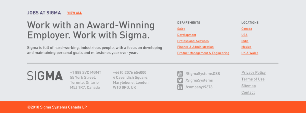
The footer positions Sigma as a forward-thinking employer while offering practical navigation and contact information. The split layout between job categories and location provides balance and functionality. Social links and legal details complete the corporate credibility layer without visual clutter.